

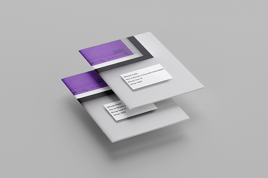
Zine
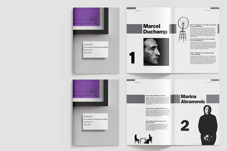
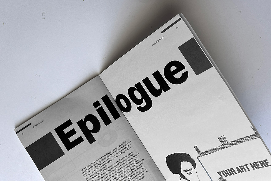
this zine takes the form of an ironic guide to becoming a successful artist, drawing on the real biographies of well-known figures from art history. the central design challenge was developing a grid system flexible enough to carry a multipage publication—keeping the visual language cohesive across spreads. each artist receives a consistent structure: a bold sans serif name, a large numeral, a halftone portrait, three step-by-step entries set in a classical serif, and a secondary image placed within within a grid. that framework, elements shift position from page to page, preventing the layout from feeling repetitive while preserving a clear identity. the typographic pairing sets the tone of the project: the modern sans serif lends confidence and clarity, while the serif body text gives the absurd advice a sense of art-historical gravity. halftone treatments unify the imagery and tie back to the title, bringing in the texture of printed monographs. the cover frames a close-up of an andy warhol piece like a museum label, signalling from the outset that the publication treats its subject with the visual language. the result is a zine that functions as both an exercise in systematic layout and a playful commentary on the strange paths that lead to artistic recognition.
let's keep in touch?


